Saturday, 26 May 2007

sidesaddle

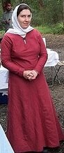
Because Joanna piqued my curiosity....

What do images show of 12th C women riding? I think I remember only sidesaddles, but can I actually provide some proof so I can say this with confidence.

Before you do, check out this fantastic article on the construction of a replica from pictures and guesswork. Someone on the 12th C mailing list pointed out that I may be using the wrong terminology. Side chair might be the better term for what I am referring to.

A quick skim of the Museum of London Book "the medieval Horse and it's equipage" reveals nothing about riding on the side, although I could have missed something in the fine text. Holmes's "Daily living in the 12th C" names a sidesaddle as a sambue in 12thC french and says that Enide rides one through out her adventures in the medieval romance Erec und Enid. The sambue is also mentioned in Aoil and in Chanson de Guilamme, where it is used with stirrups. He also says it's unclear how often they were actually used by women.

from the artwork: (as always, click on pictures for a bigger version)

The flight into Egypt, roof mural Zillis, St Martin c1140-60
Mary rides a donkey (the ears!)

The flight into Egypt, Wall painting, Church of St Aignan, Brinay, mid 12th C.
It's hard to see in black and white, but Joseph is leading the donkey.


The flight into Egypt, Bib. Nat. Ms lat. 12117, fol 108, c1050
A smidge earlier - just to prove this wasn't a new phenomenon.


The whore of Babylon, horus delectarum f258, Hohenbourg, Alsace 1170-1200
(This is a 19th C copy, but unlikely to get these big details so wrong)
Look at the lovely demon horse monster! Obviously riding on the side is not limited to sedate ladies like Mother Mary, but is also practiced by scandalous women.


Superbia (allergorical figure) horus delectarum (unknown folio)
(I don't know if this is an original or copied page - if it's a copy it's certainly one of the better ones). Superbia is leading an army to attack here. It seems rather ridiculous for her to be doing so sitting sideways, but she is. Maybe riding sideways was more ingrained than I thought, after all allegorical figures are allowed to do things like throw spears that women can't but the still can't ride astride?
Her feet are at uneven heights, whereas the previous pictures have even feet. Perhaps the others have sidesaddles with footrests, but Superbia has stirrups?


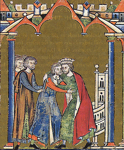
Betrix of Reithel travelling (to wed) and Queen Constance travelling (to wed Henry VI, then to Sicily, then home), Berne Codex of Pietro of Eboli's poem in honour of Henry VI, Late 12/early 13th C?
These are horses, not more donkeys, and you can see two feet below the ladies skirts. Note how they are both travelling to their new home to wed. That seems to have been a very 12th C thing - a noble lady only made one big journey in her life, and that was when she left her father's house to go to her bridegroom's house. (Or at least according to my memories of what Holmes says in "Daily living in the 12th C").

Although Constance makes 2 big trips - From home (Sicily) to the Holy Roman Empire (Germany) then back to Sicily so Henry could claim Sicily through right of marriage to her, the only daughter of the last Sicilian King (with the help of an army and a kidnapped pope). Constance was so essential to this claim that she was dragged along even though she was pregnant with Henry's heir.

The last picture is the only one you can see clearly, (sorry,I'd love a better copy of this fascinating manuscript) and Constance is clearly riding a stallion. No sedate donkeys for the wife of the richest man in Europe.


Copenhagen psalter, England, 1175-1200
f10v 3 Magi/Kings, f12r the flight into Egypt, f13r
The entry into Jerusalem

Three images of different types of riding. The three Kings show men riding horses in saddles which are high at front and back. Mother Mary sits sidesaddle on a donkey (or mule?) led by Joseph. Finally Jesus rides into Jerusalem on a donkey sitting sidesaddle but holding the reins himself. It's interesting that they portray Jesus doing this - I guess they extend the humbleness of riding a donkey one step further to riding a donkey like a woman does. I can't recall other depictions of this scene shown this way, but maybe I wasn't paying much attention. At any rate What Jesus is depicted as doing will have little relevance to ordinary men.


Picture bible, North-western France (Monastery St. Bertin ?); c. 1200, (The Hague, KB, 76 F 5)
Ah, here's a more conventional picture (I've found a few others the same now too) of Jesus' entry into Jerusalem. Humble on a donkey, but astride. Notice the apparent lack of saddles on donkeys, just a blanket. Interesting, although maybe the fabric is hiding the saddle. I guess maybe they didn't need a saddle if the donkey had a gentler gait and never went fast.


I'm not going to say that all women rode on the side, just that the illustrations give some good evidence that quite a few did - they weren't all riding astride. (No I haven't left out any illustrations of women astride, I didn't find any).

Friday, 27 April 2007

romanesque venice

I was perusing the details for a local midwinter ball recently. It's set in renaissance Venice, and clothing to suit is encouraged. Except one of the fliers left off the word "renaissance". Which got me to thinking - what was worn in 12thC Venice? I'm not going to make up a dress specifically - It's a productive year when I make 2 full garments lately, and I've worn out chemises to replace and a half sewn woolen dress. This is just a though experiment and research jaunt. Let's see how much the Internet can tell me. I guess i might as well document how Ii search too, in case it helps others.

Firstly, I'm extremely unlikely to find anything about actual venetian costume - with all my 12th C costuming links I would likely have heard about any authoritative sites. Instead I'm going to look for artworks.

Well firstly to find something out about Venice. Wikipedia has a fairly good introductory article, that confirms Venice was around and not a tiny outback town in the era. It gives a list of churches and monuments, but it doesn't give any clues about the date of these.

So I'll try googling "romanesque venice", this will probably want to tell me about building built in the era, which might just have some original decorations. I find romanesque an indispensable search term when looking for 12th C artworks.

In the first few blurbs is one that tells me of 2 romanesque churches:

  • Romanesque church of SS. Maria and Donato in the region of Murano
  • Torcello: this little island has a seventh-century cathedral, the Romanesque church of S. Fosca
Wikipedia had a list of churches in Venice I noticed earlier, and it provides Italian spellings now I know these to be romanesque:
  • Basilica di Santi Maria e Donato
  • Santa Fosca
It also has a nice article about Torcello which mentions that the Cathedral of Santa Maria Assunta has a lot of 12th C building works and decorations, and even has a picture of a 12th C mosaic from there.

Next I google image search both the English and Italian versions of the names collected above.
I've developed a fair eye for what looks romanesque, jsut by looking at hundreds of romanesque artworks. I still need to check the likely ones, luckily the era of pictures is often labelled on Italian sites that have more than one entry - and it's fairly easy to find given the convention to use roman numerals that many European countries use. "(XVI sec.)" is 16th C and "un periodo antecedente al XII secolo" sounds like the period before the 12th C for example.

so notable results:
And after all that looking, still only one real picture to show for it.

So comments upon that last linked picture:
  • To the left of Jesus is a lady in red. She appears to have both cloak and veil. The rest is obscured.
  • In the middle row, the virgin Mary stands to Jesus's left. She's not a good one to base costumes upon because she dresses more conservatively and old fashioned.
  • In the bottom row, the kneeling woman right of centre is likely to be a patron - a real person. What we can see of her dress is that it is just above floor length, and has tight sleeves with a bit of decoration at the wrists. Her red cloak appears to be also used as veil. It looks like the virgin Mary's dress and cloak isn't a bad model for her garments.
  • All in all this is a pretty generic early 12th C look. No regional differences apparent in this picture. Maybe I'd find some with a wider range of pictures. If I could be bothered.

Tuesday, 24 April 2007

gores and bias

I was explaining this to a friend, and then I thought this is something a lot of people could use knowing. A big thank you to the charming Estienne for acting as model (in his own creations no less).

Stuff beginner sewers will need to know first
The first thing you need to know if you are a beginner sewer is a few fabric terms. (If you are not a beginner sewer, skip ahead to the next section). The selvage is the bit at the edge when weaving that strengthens the whole piece - it's a bit firmer and stiffer than the rest and may occasionally have words or other colours woven into it to tell you about the fabric. When you pick up fabric on a roll, the selvages are at the sides (ends) of the roll, and run along all of the fabric. Selvages won't fray like normal edges will, something used to great advantage in garb.

Now the grainline is an imaginary line that runs parallel to the selvages. (It also represents the warp when weaving, and is the strongest thread.) If you try and stretch fabric in this direction it won't stretch much (except knit fabrics eg t-shirts and stretch fabrics, which are both pretty much modern inventions). The direction perpendicular (at 90°) to the warp/grainline/selvages is the weft and it doesn't stretch either. (Being the weft the thread may be a bit weaker too - that's why we generally cut out pieces with the longest dimension being along the grainline - called cutting on the straight grain).

The bias is either of the two directions at 45° to the grainline/warp/selvages/weft. It's quite stretchy in comparison to the other directions. In modern sewing this is used to great effect in bias cut dresses which cling to the body without using stretch fabric. It's also quite wasteful of fabric, and really tricky to do if you have narrow fabric widths. Medieval Tailors in general don't seem to have figured out that they could do this, but they didn't really need to - linen and wool shape to the body better than most cotton & synthetics do. Another way that the bias is used modernly is to create 'bias binding' which is used to bind edges of garments and can be used to make neat machine hems. Medieval tailors used straight grain tape to bind the edges of garments (eg collar, cuff edges, and even the seam allowances in the St Louis shirt) and it worked quite well for them because they used better materials and finer seams than we generally do today. I find bias binding looks almost the same as straight grain tape, so I thoroughly recommend it as a good substitute to the intermediate sewer.

While the true bias is at 45° to the grainline, that is the greatest stretch, there is still quite a fair bit of stretch at 30° to the grainline, so this partial bias can be used too. For example a full circle skirt will hang in lots of folds because much of the circle hangs on some kind of bias. A narrow A-line skirt will hang quite stiffly because most of the skirt hangs on the straight grain.


Now how this relates to gores:
Now fairly early medieval tailors did work out how to use bias to their advantage, in the form of gores. When you cut a triangle out of fabric, at least one edge is on a partial bias cut. How you situate this determines how the shirt of the dress or shirt falls.

straight edge to straight edge, bias to bias edge

When you sew a straight grain edge to a straight grain edge the two sit flat in relation to each other. They also sit a little more stiffly than they would if there was no seam there, because of the seam. This is even more accentuated when using seam finishes which sew the edges of the seam down (which is the majority of medieval examples). A modern example of this is the outside of the leg seam on jeans. This is great if you are making a piece you want to sit very flat, but the side seam of the skirt section of a shirt or dress is normally a place where you want the fabric to fall in graceful folds.

In contrast, when you sew a bias seam to a bias seam, the last thing it wants to do it sit flat. Both sides of the seam want to stretch, and you often end up with a seam that puckers and refuses to sit flat for even the width needed to sew seam allowances down. It makes your sewing look poor after a few washes with puckers and mini-gathers that you didn't sew in. Such seams also tend to curve up on themselves in a messy way. I guess I'm overstating the case here, the effects are quite minor, but do exist, and are not due to your lack of skill, but to the bias-bias seam.

One of the most common ways people utilise bias-bias and straight grain-straight grain seams is shown in diagram A. This makes skirts that stick out at the sides. (it's much less apparent on shirts). Take a look at the shirt in the photo on the right. It doesn't look like the majority of the medieval examples, and I find it rather unflattering. This is also one of the (more minor) problems I have with the trace around you quick and dirty t- tunic method - it generally also sticks out at the sides like this, unless the skirts are quite wide.

I don't have any period examples of this usage, but given that nearly everything was tried at some stage in history, I expect there are a handful. It's harder to prove something uses this pattern unless you have a detailed archaeological report that shows grainlines on the pieces. But the examples I have gathered do point to bias to straight edges being more common (as I expected).


bias edge to straight edge

When you sew a bias edge to a straight edge you get the best of both worlds for a skirt. The straight edge remains stiff and firm, but the bias edge stretchy and curvy. As you sew it, or as it washes, the bias edge may stretch a little, but the firmness of the straight edge, stops the overall shape from distorting badly. The bias edge might fall in a few more folds as a consequence of stretching, but that's just what you want a flowy skirt to do.
Possible period examples:
  • The bockstein tunic (14thC) has two pairs of gores - each has a 1 piece gore and one with a vertical seam. (note the back gore has a fake seam for symmetry, but is actually one piece)
  • the Moy bog gown has a center gore in this method. I'm not sure about the side gores.

How to cut gores, Method 1:


When used to put only two gores in the side of a garment, this cutting plan wastes quite a bit of fabric unless you want a tunic that with a gores that dip at the bottom. Gores that have a dip in the seamline are quite rare in medieval pictures.

This shape of gore can be used to good effect to produce a train . This is not the standard straight edge to straight edge arrangement, but a bias to straight edge arrangement that pushes the longer corner to the back edge of each gore. This generally works better with 3 or more gores on each side seam.
Two arrangements are probable - the first has many gores arranged in pairs to add fullness to the back of the skirt. Each pair of triangles has to be slightly longer than the preceding one if you don't want to cut a lot of fabric off your hemline.
Second just adds one of these triangles to the standard arrangement

possible period example:
  • the Gown of St Claire of Assisi (mid 13th C) has 3 pairs of gores of differing sizes. Marc Carlson's cutting diagram shows all as right angled triangles, and thus likely produced by method 1. This cutting diagram shows the largest gores as isoceles triangles, thus likely produced by method 2, however rearmost (2nd largest) gores still seem likely to have been produced by method 1. The slight train on this garment corresponds well with the rearmost gores being potentially cut by this method.
Method 2:

While geometrically appears to have about the same fabric wastage, the different distribution means that less actually is chopped off to get a panel that appears straight across the bottom. An octagon is a suitably good approximation of a circle that most people don't notice if the panels aren't trimmed at all.

This also has another advantage - it produces it produces two isosceles triangles - one for each side- of approximately equal size. Method 1 produces two right triangles, but right triangles don't sit neatly like isosceles ones do (honest!). If you have lots of fabric, you can cut two pairs of the right triangles from method one and sew them together, but if fabric is scarce, it may be difficult to get them the same width. And if they aren't approximately the same width you could end up with a lopsided garment. With method 2, you automatically produce pairs of isosceles triangles and if you cut an extra pair of gores of a different width, you can still put one of each width in each side of the tunic.

Period examples:
  • The Kragelund Tunic (probably 1045-1155AD Denmark - based on radiocarbon dates) appears to be cut in this way - it has a front gore which although slit is not seamed, but side gores which have seams. Which direction the grain runs in is not apparent from the diagrams.
  • Several of the greenland garments feature side gores to the armpits. These gores feature false seams to imply a larger number of gores. On one side a real seam runs along the centre of the gore, on the other a false seam.
  • The Moselund gown features two pairs of gores - front gore of two pieces and back gore of one split piece. Side gore ssimilarly have one large gore on one side and a pair of pieces on the other.

Manuscript possible example:
  • Maciejowski Bible c1250 example and another. The centre front line (presumably gore) points downwards and sits rather stiffly - may be using this method. I suggest that this might combine methods- with bias-to-straight grain seams at the sides and straight to straight grain seams at front (note I've drawn that closed, but the center front seam shouldn't be sewn.)
Of course I'm just guessing here - please take what I say with a grain of salt.


Conclusions:
Did I make sense? Which bits did I get wrong? Do you have any examples I haven't listed?

Thursday, 19 April 2007

Handsewing wool - stitches used?

I've been musing over what stitches would have been used to sew a 12th C women's fulled woolen dress.

References:
*Heather Rose Jones "Archaeological Sewing"
*Jennifer L. Carlson "Sewing Stitches Used in Medieval Clothing"
*http://www.cs.vassar.edu/~capriest/mensgarb.html
*"Woven into the Earth"
*MOL "Textiles & Clothing"

My conclusion - I still can't decide what would be particularly 12th C. I think I need more examples that are 12th C woolen garments without lining. Well any examples really.

Since I made a cutting error resulting in extra piecing, and this is not a competition entry, I suppose ultra authenticity doesn't matter so much. So I've decided to use the seam finish that most intrigued me. (and to get it started before Rowany Festival, even if my hope of wearing it there was futile).

It's from Hedeby in Denmark, I'm not sure exactly when - "medieval era", I'm not sure of more than that (maybe 10th C?) - the original article is rather obscure and difficult to obtain.
The seams are turned over once or twice (only once on this garment as it's fulled) and hemmed, then overcast together. One example had additional (presumably decorative) running stitch. I've pulled out my bronze needle and linen thread and it's working nicely.

Here's pictures of a seam: (Front & Back)

You can't see most of the hemming stitches from the front even though the cloth is purple and the thread stark white. You can see the construction seam sometimes, and a line of dints alongside it. I think with a few washes the wool will full together over the join and make the thread less visible.


And here's pictures of a seam in progress for those of you having trouble working out what I was doing: (laid flat & how it actually sits as I stitch)


I'm happy with the speed of this technique. Strength I will test over time with wear. I still want to know what would be the best technique for 12th C woolen garments though!

Wednesday, 14 March 2007

New tabletweaving project - seal tag

Well, last weekend I started a new tabletweaving project. It's a copy of a 13th C seal tag, with different colours.

About the original piece
This tag is described (along with 4 others) in:
Henshall, Audrey. "Five Tablet-Woven Seal-Tags." Archaeological Journal 121 (1964), pp. 154-62.

I can't find the article online, nor anything about this pattern, but did find a reproduction of one of the other seal tags from the article.

The diagram to the right (Created using GTT) shows the pattern. On a white background, squares of salmon pink and dark blue with pale yellow-green centres. Spiral/tubular tabletweaving technique has been used -the weft passes only in one direction, stitching together the two sides into a tube (ie the back is never visible).

Technical details reported by Henshall:

  • on a charter granted by John de Balliol King of Scotland 1 August 1294
  • S twisted, Z plyed silk
  • White and green yarns thinner than others, green used double
  • White also used for weft
  • 1.5mm wide, 46cm long (remaining)
  • 16 threads per cm
  • All tablets except 4th tablet (all white) threaded in the same direction
  • reversal points every 1.75 to 2.75 inches
I'd like to post a picture here of the original, but the photocopy of a photocopy I've got is rather low resolution. (If anyone has access to the journal and a scanner ...)

Choices for my reproduction
So, I decided to dig out my silks. I chose the lochac colours of (off) white, red and blue, since I don't have any use for a seal tag, so it might as well enhance the glory of the Kingdom. With only 3 colours instead of the original 4, I decided to use background white inside the squares replaceing the green. Blue and white remain the same as original patern (including using white for the warp), and red replaces the pink.

The silks are 60/2 and I didn't check the spin direction, but I suspect the red and blue are conventional S spun, Z plied. The white is actually 90/3 I think, which is pretty much equivalent to 60/2, but there is something less satisfying about this roll of thread. It unplys easier and tangles more, and also snaps easier. I think this might have to do with the direction of the spin and plying, or just the extra threads. At any rate, I much prefer the colours for working with.

Other than the colours, I've attempted to make no other changes to the patterns on the original.

My observations


That picture is approximately real size (sorry it's so dark - no flash on supermacro mode). I've woven approx 20cm already in about 3 very distracted hours, so it's working up quite quickly despite the fineness of the thread.

The width of my band seems about right. It looks to my eye to be more than 1mm and less than 2mm. I need to check it against a ruler, but unless I'm wrong, I'm not going to get much more accurate than that without someone to lend me a micrometer.

I need to count the number of threads per cm, but i suspect it's less than 16.

Henshall says the cord spirals when the direction of the cards and twist of the yarn coincide. My cord spirals in both weaving directions, but it does seem to spiral more in one direction.

If you haven't worked it out from the last section, the off-white thread has been a pain. Used single as a weft it snaps frequently. (yes that is what the fluffy bits are in the picture) Using it doubled seems to fix that problem.

I can't get the tension as tight as I would like (even when the warp doesn't snap). The join between the sides is approx 3 cords (ie 4 threads that go through a tablet) wide and ladder like. This makes the cord unsymmetrical as one side has one cord between the squares and the other a much larger gap. I can't get enough detail on my photocopy to be sure, but I think the original is nearly symmetrical.

The one card threaded differently Henshall interprets as a mistake. I'm not convinced. The fact that it's the all-white card between the two squares makes this contentious. The designer could be trying to offset the spiralling a bit. But then that leads me to ask why both all white cards aren't alligned in the opposite direction. Until I wove it, and realised that the direction of the edge white card is obscured by the warp thread anyway. I think it is possible the direction of that card was deliberate, although the other all white card may have been intended to sit in the same direction also.

I wove a small section with all cards facing in the same direction. The white line appears sightly broader, but that's about the only difference.

My first reversal point was less frequent than in the original - approx 10-12cm rather than 1.75-2.75 inches (4.4 to 7cm), and My threads weren't very tightly twisted when I did remember to reverse. I can concieve of 3 reasons for a smaller distance betwen reversal points:
  • They worked at a much higher tension than me, and so the threads got too tight to turn easily more quickly than my threads.
  • They deliberately used reversal points before the tension significantly increased across the threads in order to achieve a more evenly tensioned product
  • They were working on a significantly smaller loom than me
The first option seems unlikely - my tension is a bit loose today, but not very much so.
I'm not sure I buy the second option - I know people who are using swivel hooks because they couldn't find a reversal point in 2m of all forward viking tabletweaving. The reguar irregular spacing speaks more of necessity than memory.

The last option interests me most. Most of the pictures and one extant loom we have are of band looms approx 2m across. My loom is only 1m across. And yet to get tight threads after such a short distance, I'm estimating a 50-70cm loom would be required. We don't have many pictures of small looms. And yet, just as big looms make sense for large projects, smaller looms for smaller projects would make tensioning during warping up easier.

I just don't have enough evidence to do more than speculate.

Monday, 19 February 2007

Two sparsely illustrated 12th C manuscripts from Regensburg

Nothing exciting today, mostly just crossing these manuscripts off the list.

Ambrosius, Hexaemeron,
(München, Bayerische Staatsbibliothek, Cod. lat. 14399).
Prüfening (Regensburg), around 1165 and 1170,


The Manuscript was made under Abbot Gossuin (1131/3-65), and although we have photos of it, the manuscript is now lost . Dodwell says this has 7 full page pictures of creation largely borrowed from the Admont Bible. He says Regensburg/Prüfening coppied Salzberg artwork (which in turn ws copying byzantine) a lot, but created thier own sub style. There is not much of costuming interest in this manuscript - figures of christ are too traditional to show contempory clothing.

Isidori Hispalensis - Etymologiarum libri 9,
München, Bayerische Staatsbibliothek, Cod. lat. 13031
Prüfening (Regensburg), before 1165, (probably 1160-5)


Annother manuscript Regensberg style. This one is still extant, I think. Again, little costuming detail, this tiem with the exception of a monk's costume. Since this manuscript was written by monks, we can expect heir self depiction to be knowledgeable, and likely accurate.
  • [1v] Men in Clothing in the Regensberg style - shirts/albs visible below tunics, much trim. Except the man lysing down, who is the monk author having his soul judged.
  • [46], [80] Decorated Initials (no people)
  • [102v] ancestry chart - lots of small torso sections only. Can see some female hairstyles on zoom.

Friday, 26 January 2007

Regensburg Manuscript - Vitae et passiones apostolorum

"Vitae et passiones apostolorum" (München, Bayerische Staatsbibliothek, Cod. lat. 13074.)
Prüfening (Regensburg), 1170/1180.


A more heavily illustrated manuscript, with quite a few women illustrated, but no calf length tunics and no patterned fabrics.

Women in the manuscript:
I haven't included picture captions, as bildindex was unusually uninformative. (captions such as "
Minature from Matthew")

[28], [66v], [90], [140], [100v],
Plain dress with flared sleeves, veil (or loose hair), some with rucked up chemise sleeves. The veils are probably wrap around ones - see how the 2nd image has a clear line across the shoulder where a wrap would cross itself, and the others have similar pattern of folds.


[66], [66v], [82v], As above, but with beanie caps. The beanie caps are worn over the same veils as above or just over the hair (2nd lady, first image). Most have bands of trim around the edge. Some of them are a plain circle, others vee upwards on the forehead. Several here appear to be worn jauntily, slightly off centre on the head, but they could be ones with a vee where i can't see the second side clearly. The one's that don't vee remind me of Jewish skullcaps.


[90v] Veil is loosely draped - doesn't cover front of neck. Rest of dress same as others. This could be a man (i've seen such head drapes on people with beards), but I don't think so.


[100v] Dress same as others, but she is wearing a turban. It's hard to tell with the smudge mark, but I think she is wearing the same wrap veil as the others (you can even see a dangling end behind her shoulder), and then the turban on top of that. It could be a pre-wrapped turban. Or it might be a different variety of hat I've not seen before, but I'm pretty sure I can see bands of wrapping. Her face appears to be contorted (big nose, fat face, scowl?) which may be a racial stereotype, or may just be me reading too much into a smudge mark. I should note my reasons for assuming this is a female - floor length dress and long maunches, features I haven't seen on guys before (ankle length, or longer with a slit, and only short maunches I have seen).


Image summary of remaining pages and rest of featured pages:

I find this manuscript a little strange in it's fashion sense. About half the men are still wearing the fashion of the prüfening miscellany - tunics with shirts showing underneath and many bands of decoration. But none of the women wear the female version of this fashion - all have floor length dresses, and none even have a band of decorated trim on the end of their sleeves. Some have what looks like a plain coloured band, but no decoration. Perhaps the artist didn't have enough time to do such elaborations (but calf length doesn't take time) or perhaps this vain fashion was not considered appropriate for saintly women (but none wear halos, and other manuscripts show Mary with a calf length tunic). Or maybe this shows a diversion over time (this manuscript is slightly later than the others so far) from byzantine fashion?

Wednesday, 24 January 2007

Revisiting the Prüfening Miscellany

Gloss of the Bishop Salomon 3. of Konstanz (München, Bayerische Staatsbibliothek, Cod. lat. 13002.)
Prüfening (Regensburg), 1158 and 1165,


If this manuscript looks familiar to me, it is because it is. I've previously written about 2 pages of this manuscript under the title Prüfening Miscellany.

Stylistically it's also a lot like another manuscript I've already written about - Bayerische Staatsbibliothek, ms. lat. 14159 made at Regensburg Abbey a little later (c1170/75).

summary of illustrations:

  • [1v], [2], [2v]Medical text. Shirts visible below tunic hem. Men with band of trim at mid thigh height (1v, could this just be a badly drawn visible shirt?) . Much trim.Cingulum style belts including wide ones in patterned fabric(2,2v). Phrygian cap in patterned fabric (2,2v). Glimse of Braes? (2v)
  • [3] medical diagram of the body
  • [3v], [4], [4 again], virtues and vices see previously entry on these pages.
  • [4v] castle diagram (no people)
  • [5v] mostly bishops & kings (little clothing detail)
  • [7v] microcosmos interlinked diagram (no clothing)
  • [8] and [8 again], [8v], [8v closeup], [13v], [80], [89v], [179], [?], [208], [209] decorated initials (no people) or text with slightly decorated borders (no people)
Folio 1 and 2 are the most exciting - more pictures in the style of the virtues and vices pages. Unfortunately all the figures are male. We get a lot more working men, and less kings and bishops, but the details are really much the same as the virtues and vices details. The brocaded fabric phygian caps are the only new addition.

Tuesday, 23 January 2007

Less interesting manuscripts from Regensburg/Prüfening

A Collection of links to 12th C Manuscripts from the Regensburg/Prüfening Abbeys. Pictures of costuming interest are annotated.

Rupert von Deutz, "De officiis divinis" (München, Bayerische Staatsbibliothek, Cod. lat. 14355)
Prüfening (Regensburg), 1140/1150


Two texts from Hieronymus and two papal directives (München, Bayerische Staatsbibliothek, Cod. lat. 13102)
Prüfening (Regensburg), before 1140

"Augustini in actus sancti Johannis tractatus" (München, Bayerische Staatsbibliothek, Cod. lat. 13085)
Prüfening (Regensburg), around 1140

  • fol 89: Wandering Jew (unfinished sketch) -What looks like a straw hat with an exaggerated point. Jews were represented in a conical hat, I think this is a characature of one, complete with exaggerated beard.
  • other images: [183v]

Rhabanus Maurus, "Explaination of Matthew's Gospel" (München, Bayerische Staatsbibliothek, Cod. lat. 13032)
Prüfening (Regensburg) before 1140

  • folio 1: Initial M with King - He might have a separate piece skirt. Rippled sleeves on tunic (not shirt).
  • Other images: [6], [119v], [183v].

exegetical (relating to exegesis) manuscript (München, Bayerische Staatsbibliothek, Cod. lat. 14398)
Prüfening (Regensburg), around 1140

  • folio 1a: royal portrait - A thin (perhaps sketched and not filled in?) band of trim on the forearm as well as at the wrist. Also a decorative roundel on the cloak.
  • folio 1v: The author Bede- decorative bands on forearm and bicep. A sideways keyhole neckline.
  • other images: [folio 2].

Haymonis "Exposition to the letters of the Apostle Paul" (Handschrift, München, Bayerische Staatsbibliothek, Cod. lat. 13036)
Prüfening (Regensburg), 1146/1155,

Gradual or Antiphon, (München, Bayerische Staatsbibliothek, Cod. lat. 10086).
Prüfening (Regensburg), 1176/1200,

Gospels and prayerbok, (München, Bayerische Staatsbibliothek, Cod. lat. 14444).
Prüfening (Regensburg), 1186/1200
Well apart from a nice image of a sideways keyhole neckline in the first post, if you've read this far, you've seen a lot of average pictures that aren't particularly useful for costuming. Sorry. Had to cross them off my list.

Technical German 101- Religeous Iconographic Terms

Using Bildindex, I see lots of captions in German. And I have just enough German to be not able to translate them properly. Because they are as obscure as the English captions are. Fortunately they are also standardised like the English ones, so after a bit of guesswork, I can work out what the standard labels are mostly.

Here's my list so far (I'll try to update it):

  • Verkundigung = Annunciation (when the Angels told Mary she was going to have a baby - March 25)
  • Johannes der Täuber = John the Baptist
  • Schwiegermutter = Mother in law
  • 3 Frauen am Grabe = 3 Marys at the grave (Jesus's grave, finding it empty)
  • "Noli me Tangere" (latin, not german) ="touch me not" - what Jesus said to Mary Magdalen
  • Ungläubiger Thomas = doubting Thomas
  • Martertod=Martyrdom
  • Himmelfahrt = Ascension (being lifted bodily to heaven, as Christ and Mary are shown)
  • Geburt = Birth of
  • Kreutzigung = Crucifixtion
  • Maria = Mary (generally as in "the virgin" Mary)
  • Christi = Christ, Jesus
  • Steinigung = Stoning
  • Flucht nach Ägypien = Flight to Egypt
  • Beschneidung = the Circumcision (generally of Jesus)
  • Darstellung im Tempel = Presentation in the temple (the equivalent of christening)
  • enstehungsort = point of origin
  • Evangeliar/evangelium = Gospel book/gospels
  • Graduale = Gradual (choir book used in the Mass, ordered for the liturgical year; also included introits, tracts, alleluias, offertories, and communions)
  • Antiphon = Antiphon ("One or more psalm verses or sentences from Holy Scripture which are sung or recited before and after each psalm and the Magnificat during Matins and Vespers")
  • Gebetbuch = prayerbook
  • Glossar = gloss/glossary ("a collection of words about which observations and notes have been gathered")
  • Kreuzzug = crusade
edit: June 2007
Some terms used to describe cathedral treasury contents (mostly metalwork):
  • Eichenholz = oak
  • Email = enamel
  • emailliert = enamelled
  • Siber = silver
  • Silberblech = sheet silver
  • Wappen = crest/device/coat of arms
  • Truhe = chest/coffer
  • Kunstgewerbe = arts-and-crafts/applied arts
  • Zedernholz = Cedar
  • Kupfer = copper
  • lasiert = glazed
  • vergoldet = gilded/gold plated
  • kasel = chausible
  • chormantel =? cope
  • edelmetall = precious metal
  • Hohlguss = hollow casting
  • Geißel = flagellum
  • Karl der Große = Charlemange
  • Ziborium = Ciborium
I suppose i should mention - If you know I've got something wrong, please correct me.